Often Misidentified Precancel Typesby David Marasco... Edmonton types 2 and 3: ... 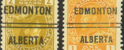 Neither
type has any scroll work at the bars. Neither
type has any scroll work at the bars.
In type 2 the letters are all noticeably bigger than the type 3. If you already have a copy of both types 2 and 3 the comparison is easy. ... ... ... ... Hamilton types 3 and 4: ... 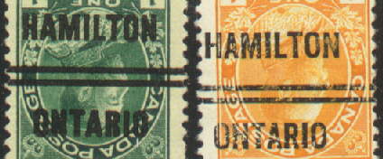 Neither
type has any scroll work at the bars. Neither
type has any scroll work at the bars.
To distinguish: Look at the H of Hamilton, type 3 is narrow and type 4 is wide. Look at the A of Hamilton, type 3 the bottom of the legs of A are spread wide, type 4 the bottom of the legs of A are closer together. Look at the 'foot' of the R of Ontario, type 3 is curved downward, type 4 is straight angled downward. ... Montreal types 2 and 4: ... 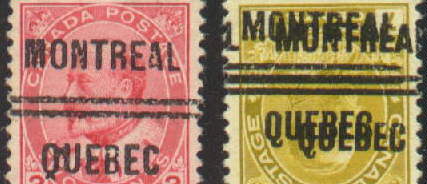 This
is an easy one, look at the tail of the Q in Quebec, type 2 the tail is
two pronged (like ^ ) and type 4 the tail is curled down then back up.
A difficulty arises if the Q part of the overprint is not shown or is somehow
not clearly visible (ie: the overprint impression is light or partly missing)
and there is no scroll work at the bars. The way to distinguish is to put
the sample beside a known type 2 with scrollwork and a known type 4 with
curly tail and compare the other letters. This
is an easy one, look at the tail of the Q in Quebec, type 2 the tail is
two pronged (like ^ ) and type 4 the tail is curled down then back up.
A difficulty arises if the Q part of the overprint is not shown or is somehow
not clearly visible (ie: the overprint impression is light or partly missing)
and there is no scroll work at the bars. The way to distinguish is to put
the sample beside a known type 2 with scrollwork and a known type 4 with
curly tail and compare the other letters.
You will see these differences. The B in Quebec: type 2 the B is taller and narrower, type 4 the B is shorter and wider. The A in Montreal is wider in the type 4. The M in Montreal is wider in the type 4. ... Ottawa Types 1 and 3: ... 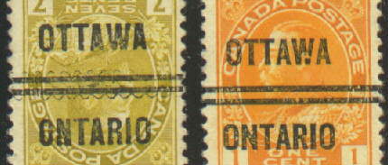 If
there scroll work is missing on the type 1 they can be distinguished by: If
there scroll work is missing on the type 1 they can be distinguished by:
The N in Ontario is narrow and tall in type 1 and shorter and wider in type 3. The foot of the R in Ontario is curved in type 1 and straight in type 3. ... ... ... Toronto types 3 and 5: ... 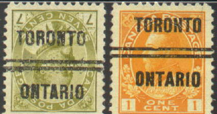 If
the scrollwork is missing on type 3 you can distinguish by: If
the scrollwork is missing on type 3 you can distinguish by:
The foot of the R in Ontario is curved in type 3 and straight in type 5. The A in Ontario is narrow at the base in type 3 and wider at the base in type 5. ... ... ... ... ... Toronto types 7 and 12: ... 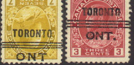 No
scrollwork on these types. No
scrollwork on these types.
In type 7 the 3 bars are bowed apart in the center of the overprint. type 12 the 3 bars are parallel. In type 7 ONT is longer, there are larger spaces between the letters, in type 12 the letters of ONT are closer together. ...... ... Windsor types 1 and 3:
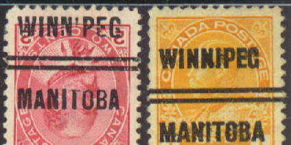
Winnipeg types 1 and 3:
.... |
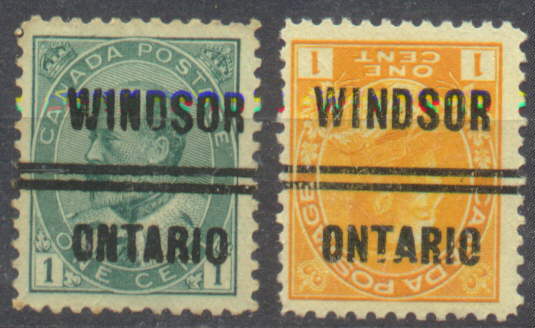 If
the scrollwork of type 1 is missing:
If
the scrollwork of type 1 is missing:
 If
the scrollwork of type 1 is missing:
If
the scrollwork of type 1 is missing: